Lilac Reverie Violet, Rose Pink & Lavender Oval Bracelet with Gold-Tone Chain — A Soft Romantic Palette with a Little Heart Detail
Lilac Reverie Violet, Rose Pink & Lavender Oval Bracelet with Gold-Tone Chain — A Soft Romantic Palette with a Little Heart Detail
Couldn't load pickup availability

🦋 A Softer Way to Bring Color into the Room
The outfit is almost decided. An ivory sleeve, a favorite bag, something comfortable enough for the plans ahead. Then you notice the one space that still feels unfinished: a bare wrist beside the cuff. Lilac Reverie begins with that small opportunity, bringing violet, rose pink and pale lavender into a fine-chain bracelet concept rather than a large statement silhouette.
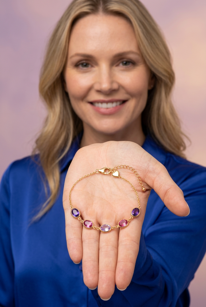
Its mood is romantic, but its arrangement is orderly. Two deeper violet ovals frame the colored section. Two rose-pink accents sit closer to the middle. A pale lavender oval completes the center. The sequence mirrors itself, giving the softer palette a defined structure. Warm gold-tone borders outline every accent, and a delicate chain continues beyond the color toward the closure.
This is color at a more intimate scale. It is meant to be noticed when you reach for a cup, turn back a sleeve or hold the bracelet in your palm. You do not need an elaborate occasion to appreciate the relationship between a light lavender center and the darker violet ends. A simple outfit already gives that relationship somewhere to appear.
🌸 Scene One: A Pale Center, Framed by Two Shades of Romance
Start with the macro photograph, where the five oval accents lie in a clear row. The center is the palest part of the arrangement, a lavender tone with lighter-looking facet planes beside softer purple areas. The pink accents on either side introduce more warmth. At the outer edges, violet brings depth and marks the transition into the fine chain.
The design does not depend on five completely different colors. It explores variations within a related palette. Lavender provides the quiet midpoint, rose pink creates a gentle change in temperature, and violet gives the composition its stronger outline. That is why the bracelet can feel soft without disappearing against its surroundings.
In the peach-background image, the purple tones stand apart from the warmer surface. Against lilac fabric, the palette becomes more closely related to the scene, while the gold-tone borders provide separation. The same color sequence can therefore create either contrast or continuity, depending on the clothes around it.
A palette note, not a gemstone claim
Violet, rose pink and lavender describe the intended colors in the images. They do not identify the accents as amethyst, pink sapphire or any other verified gemstone. Likewise, the faceted appearance is a visual observation, not a material specification.
🪞 Scene Two: Move Closer and the Smaller Lines Become Important
At first glance, you might notice only the colored centers. The detail view invites a slower reading. Each oval has a gold-tone bezel-style rim that follows its rounded outline. Between the settings, small connecting links create an interval before the next accent. This repeated pause matters: it keeps the five colors from becoming a single uninterrupted strip.
The border also creates a warm line between the colored center and the fabric beneath it. On the palest lavender accent, that outline makes the oval easier to distinguish. On the deeper violet accents, it adds a brighter edge beside the darker-looking color. One framing treatment serves two different visual purposes across the same design.
The silhouette, in three scales
- The colored ovals: the largest visual elements, concentrated across the front of the bracelet.
- The connecting links: small gold-tone intervals that separate the accents while keeping the sequence continuous.
- The fine chain: a quieter line that carries the design beyond the violet ends toward the closure.
This progression is what gives the concept its delicate visual profile. It is not a broad cuff or a solid band of color. No actual weight, comfort performance or manufacturing method is established by the pictured proportions.
🎀 Scene Three: The Detail You Discover After the First Look
The closure-side photograph tells a different part of the story. A lobster-style clasp sits beside a small heart-shaped charm, larger extension links and a rounded end detail. The colored section remains in the background, but the focus is now on the warm-toned finishing elements.
The heart introduces a shape that is different from the five ovals without overwhelming them. It is a secondary detail, tucked near the closure rather than placed in the middle of the colored row. For someone who enjoys small decorative touches, this is the part of the design worth looking for after the palette has caught your attention.
The extension links are shown as part of the intended construction. They suggest multiple attachment points, but do not establish exact wearable length or a verified adjustment range. That distinction is important: a visible extension is a design feature, not proof that the bracelet will fit every wrist.
🧵 The Outfit Notes: Romantic Color Without a Matching-Set Rule
If your wardrobe starts with neutrals
Use ivory, cream or warm beige as a quiet backdrop. The wrist-worn image shows how a plain ivory sleeve can leave the colored section easy to notice. Turn the cuff back enough to reveal the accents, and keep the rest of the wrist visually simple. The violet and pink provide the variation, while the fine gold-tone chain echoes the warmer tones in the outfit.
If you already love purple
Try a lavender layer, but do not worry about finding an exact shade match. The folded lavender clothing in the styling image relates to the pale center while allowing the deeper violet ends to remain distinct. One related color in the clothes is enough to connect the outfit to the bracelet. Repeating every shade can make the combination feel more complicated than it needs to be.
If you prefer a darker foundation
Navy creates a stronger backdrop for the rose-pink accents and pale lavender center. It offers contrast without introducing another bright color. A clean navy sleeve beside the gold-tone chain can make the smaller links more noticeable, especially when the cuff does not cover the front section. Let the bracelet be the softer element within an otherwise structured look.
If you want warmth around the cool tones
Peach is the clearest example in the product imagery. It sits beside the pink accents comfortably but remains warm enough to distinguish itself from the violet and lavender. Try a peach blouse or a simple warm-toned layer, then avoid a busy pattern directly beside the wrist. The goal is space for the five small shapes, not a full floral costume.
🫖 An Interlude: A Cup, a Cuff and a Little More Personality
The cafe image brings the concept into an ordinary setting. An ivory knit cuff ends beside a teal table, a coral cup sits nearby, and the bracelet follows the visible curve of the wrist. Not every accent faces the camera equally, which is a reminder that a bracelet is seen in changing angles rather than as a permanently flat row.
Imagine a relaxed afternoon with the same styling approach. There is no need for the jewelry to explain the whole outfit. It simply adds a few related colors in the space between sleeve and hand. A closer look reveals the pale center, then the pink, then the violet. The interest is in those small discoveries rather than a large motif that announces itself from across the room.
👐 The Presentation Study: Held as a Loop, Resting in a Palm
The brunette model holds the bracelet near the collarbone, allowing the colored section to form a compact curve beneath the chain. This view makes the mirrored sequence easy to follow without suggesting that the bracelet is a necklace. The blonde model presents the closed loop in an open palm, with the clasp, heart detail and extension visible above the colored row.
These two views are intended to help you understand the overall design. They are not measurement references and should not be used to infer exact length, oval dimensions or weight. For the least distracting view, the white-background image removes the fabric and studio props so you can study the intended arrangement on its own.
🗒️ A Clear Note Before This Concept Becomes a Real Purchase
The imagery represents one bracelet concept with five oval accents, a fine gold-tone chain and a heart detail near the closure. Clothing, cups, paper shapes, fabric and pedestals are styling props, not depicted as included accessories. The differently colored backgrounds do not represent different bracelet variants.
Gold-tone describes appearance, not solid gold content, plating or base-metal composition. Skin compatibility, water resistance, durability, dimensions, packaging and specific care requirements remain unverified. No hypoallergenic, waterproof or universal-fit promise is made. Those properties must be confirmed against the actual manufactured item.
Lighting and display settings can change how the pink and purple shades appear. The images communicate an intended palette and silhouette rather than guaranteeing an exact real-world color match.
🪷 A Small Romantic Detail, Presented at $40.00
Lilac Reverie offers a gentler alternative to a full-spectrum color story: violet at the edges, rose pink in the transitions and lavender at the center, all framed with a warm gold-tone line. Its personality comes from the arrangement, the repeating oval outlines and the small heart that appears when you turn your attention toward the closure.
Give it an ivory canvas, connect it to a lavender layer or place it beside navy for a clearer contrast. You can keep the rest of the outfit familiar. Sometimes a softer color story is all the change you need to make a familiar combination feel more personal.
Design concept disclosure: all images are AI-generated visuals, not photographs of a verified manufactured product. Actual materials, measurements, fit, packaging and performance specifications must be confirmed before sale.