Ocean Muse Deep Blue, Aqua & Green Oval Bracelet with Gold-Tone Chain and Heart Detail — A Coastal Color Story for Everyday Dressing
Ocean Muse Deep Blue, Aqua & Green Oval Bracelet with Gold-Tone Chain and Heart Detail — A Coastal Color Story for Everyday Dressing
Couldn't load pickup availability

🌊 A Color Map of the Coast, Drawn in Five Oval Accents
Deep blue at the edges. Clear-looking aqua in between. A green center that gives the whole arrangement somewhere to land. Ocean Muse is a bracelet concept built around these three related colors, repeated in a balanced five-accent sequence. It brings a coastal mood into a fine-chain silhouette without relying on large nautical motifs or a broad statement band.
The palette is cool, but the framing is warm. Gold-tone rims trace each oval, small links connect the colored section, and a delicate chain continues toward the closure. That contrast gives the design its character: blue and green provide the depth, while the warm outlines keep every shape distinct. You can see the relationship clearly in the peach-and-teal hero image, where the colored centers stand apart from the softer surface beneath them.
This is not a piece that asks you to wear an entire theme. It offers one small reference to the colors you might notice along a shoreline, then leaves room for your own clothes, routines and sense of style. A plain cuff can frame it. A darker shirt can make the aqua accents more visible. A warm neutral can draw attention to the gold-tone lines.
🧭 Start Here: Follow the Sequence from One Blue Edge to the Other
Deep blue → aqua → green → aqua → deep blue
The two deep-blue outer accents establish the ends of the colored section. Moving inward, the aqua ovals introduce a lighter interval before the green center. The arrangement mirrors itself around the middle, so it remains visually balanced whether the bracelet is laid in a circle or suspended from the fingertips. Rather than five different colors competing for attention, there are three tones with distinct roles.
Look at the macro photograph and the sequence becomes especially clear. The blue accents contain darker-looking planes beside brighter areas. The aqua accents have a paler, more luminous appearance in the image. The central green provides a deeper midpoint. These shifts are visible within the faceted-looking surfaces, not just between the colors, which is why the front section has more visual texture than a simple strip of blue and green.
The color names describe the concept imagery. They are not claims that the accents are sapphires, aquamarines or emeralds. Ocean Muse takes inspiration from a palette, not from an unverified gemstone specification.
🐚 Three Design Decisions That Keep the Look Delicate
Decision one: give every oval its own outline
The gold-tone bezel-style rims make each colored center readable as an individual shape. A rounded border follows the oval perimeter, creating a warm dividing line between the cool color and the space around it. That border is part of the visual design, not a claim about the metal composition. In the close-up, you can follow the rim around the green center and see how the same treatment continues across the aqua and blue accents.
Decision two: leave a little space between the colors
Small connecting links interrupt the row of ovals. These spaces prevent the front section from looking like one continuous plate. They also repeat the chain color between the accents, so the warm outline does not disappear once your eye reaches the middle. The result is a rhythm of color, link, color, link, with the five-accent section remaining the clear focal point.
Decision three: let the fine chain become the quieter half
Beyond the blue ends, the finer cable-style chain carries the design toward the closure. It changes the visual scale from larger colored ovals to smaller links. That transition gives the concept its delicate profile: there is a concentrated area of color at the front, then a more understated line around the rest of the bracelet. No verified weight or comfort claim is implied by that appearance.
🫧 The Reverse View Has Its Own Small Surprise
Turn your attention from the colored section to the closure detail image. A lobster-style clasp, larger extension links, a rounded end element and a small heart-shaped charm appear in the intended design. The heart is deliberately quieter than the blue and green front. It adds a softer shape beside the functional-looking hardware rather than becoming a second statement motif.
The contrast in link sizes also makes the closure area easy to identify in the photograph. The main chain has a finer visual texture, while the extension uses larger open links. Several attachment points are pictured, but photographs alone cannot establish the actual adjustment range or wearable length. The extension is a visible design feature, not a universal-fit guarantee.
🪸 The Styling Lab: Change the Backdrop, Change What You Notice
Experiment A: warm peach behind cool color
In the coral-pedestal image, the bracelet is arranged against a warm surface with deep-blue fabric behind it. The aqua accents become particularly easy to distinguish from the green center, and the gold-tone chain creates a fine outline against the coral. To borrow this idea for clothing, try an apricot blouse, a soft peach knit or a warm beige sleeve. You are using contrast, not trying to match the bracelet exactly.
Experiment B: navy for continuity
The folded navy fabric in the wardrobe image relates to the two deep-blue outer accents. This creates continuity between the outfit and the jewelry without making every element the same shade. Leave the aqua and green as the points of variation. A plain navy shirt with one turned-back cuff is enough; a heavily patterned sleeve may make the small connecting links harder to notice.
Experiment C: lilac for a gentler combination
Lilac offers a softer alternative to a strong blue-and-coral contrast. It remains cool enough to sit comfortably beside the blue and aqua tones, while the green center introduces a different note. Try the bracelet with a lilac layer and an ivory base. Keep additional wrist jewelry visually restrained if you want the five oval shapes to remain the focus.
Experiment D: ivory as breathing room
The model imagery demonstrates the simplest option. An ivory blouse removes most of the competing color from the outfit, leaving the bracelet to provide the blue-green sequence. This approach is useful when you like colorful jewelry but do not want to reorganize your wardrobe around it. Begin with a clean neutral and add one deliberate detail.
🕊️ An Ordinary Pause, with a Different Kind of Blue
The cafe scene brings the concept back to everyday scale: an ivory sleeve, a hand resting beside a coral cup and a teal tabletop. The bracelet does not dominate the scene. Its colored section follows the visible curve of the wrist, and the fine chain continues beyond the accents. Some elements naturally turn away from the camera as the bracelet follows the hand.
Picture using that same visual restraint in your own outfit. You might be taking a break between meetings, settling into a cafe or deciding what to wear for a relaxed afternoon. The bracelet adds color at close range, where small details can be appreciated. Its coastal inspiration is a mood you can carry into an ordinary setting, not a reason to reserve it for a holiday.
🤍 From Fingertips to Open Palm: Read the Shape in Two Ways
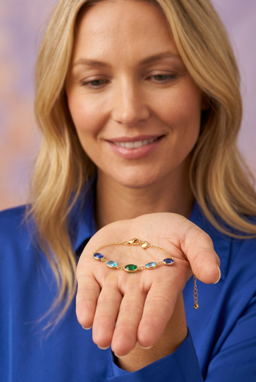
Held as a loop near the face, the bracelet shows the five-accent curve as a compact composition. The green center sits between the two aqua accents, while the darker blue ends connect back toward the fine chain. In the open-palm photograph, the design lies closer to the hand, making the contrast between the colored section and the closure area easier to understand.
Neither image is a measurement chart. They show the intended visual proportions of the concept, but do not establish exact dimensions, weight or suitability for a particular wrist. The white-background image is the clearest place to study the overall arrangement without fabric or studio props. The macro images provide a closer view of the pictured surfaces and links.
📝 Your Before-Purchase Checklist
- One design, five accents: the imagery represents one bracelet concept with a blue, aqua and green sequence, not five separate bracelets.
- Appearance versus composition: gold-tone refers to color. Metal type, plating and accent materials remain unverified.
- Fit needs real measurements: pictured extension links do not establish the bracelet's wearable length or adjustment range.
- No performance assumptions: water resistance, hypoallergenic properties and durability testing are not claimed.
- Scenes are styling references: clothing, cups, pedestals and other props are not depicted as included accessories.
Perceived shades can also vary with lighting, surrounding colors and screen settings. Use the images to understand the intended palette and shape, rather than as a guarantee of an exact real-world color match.
💧 A Cooler Color Story, Presented at $42.00
Ocean Muse brings together five oval accents, three cool hues and one warm gold-tone frame. Its strongest idea is not excess sparkle or a complicated motif. It is the relationship between deep blue, aqua and green, arranged with enough repetition to feel considered and enough contrast to keep your eye moving.
Choose peach for contrast, navy for continuity, lilac for softness or ivory for a quiet canvas. Let the bracelet supply the smaller story within the outfit. You do not have to be near the coast to enjoy its colors; you only need a little space at the wrist for something thoughtfully arranged.
Design concept disclosure: these are AI-generated images, not photographs of a verified manufactured item. Actual materials, measurements, fit, packaging, care instructions and performance specifications must be confirmed against the real product before sale.