Sunset Bloom Pink, Peach & Amber Oval Bracelet with Gold-Tone Chain — A Warm-Color Story Finished with a Little Heart
Sunset Bloom Pink, Peach & Amber Oval Bracelet with Gold-Tone Chain — A Warm-Color Story Finished with a Little Heart
Couldn't load pickup availability

🌅 Your Favorite Sunset, Reimagined as Five Small Moments of Color
Begin with the center. A honey-like amber hue anchors Sunset Bloom, flanked by two peach-colored ovals and finished with a pink accent at either end. Instead of moving through every shade of the rainbow, this bracelet explores one warm corner of the color spectrum. It is a composition of related tones: golden, softly orange and richly pink, each framed by a gold-tone outline and connected with fine links.
The idea is simple, but the details make it interesting. The peach accents bring a lighter interval between the deeper pink ends and the amber center. The repeated oval silhouettes create order, while the faceted-looking surfaces introduce contrast within each color. In the photographs, bright patches sit next to darker planes, making the front section feel more dimensional than a row of flat-colored dots.
Sunset Bloom is for the outfit that needs warmth rather than more complexity. An ivory sleeve, dark-blue fabric or a quiet lilac layer can provide the backdrop. The bracelet supplies the small color story: balanced, expressive and easy to notice up close.
🍑 The Palette Recipe: Two Pink Notes, Two Peach Notes, One Amber Center
Think of the arrangement as a visual recipe rather than five unrelated decorations. Pink gives the two outer edges their strongest color. Peach softens the transition toward the middle. Amber provides the golden focal point. Because the sequence mirrors itself around the center, the design feels composed even when the bracelet is loosely curved in a hand or arranged across fabric.
The peach-and-teal hero scene emphasizes this warm-cool relationship. A coral pedestal and apricot fabric echo the front accents, while the deep teal background gives them separation. In the blue-background image, the same colors feel more pronounced. The bracelet has not changed; the surrounding color has changed the way you notice it. That is useful styling inspiration for your own wardrobe.
Read the color story from the outside in
- Pink at the edges: two richer accents frame the front section and mark where the fine chain meets the colored sequence.
- Peach in the transition: two softer tones bridge the stronger pink and the golden-looking center.
- Amber in the middle: one warm central accent gives the mirrored arrangement its focal point.
These names describe the pictured colors, not verified gemstone identities. The appeal here is the palette and its arrangement, rather than a claim about precious stones.
🧡 The Detail Notebook: What You Notice When You Move Closer
Rounded borders, clear individual shapes
Each oval is surrounded by a smooth-looking gold-tone bezel rim. The border gives the colored center a defined outline, so one accent does not visually merge into the next. Look at the macro image and you can follow the warm rim around every oval, then see the smaller connecting links between them. That alternation between oval and link establishes a gentle rhythm across the front.
A fine chain instead of a broad band
The colored section is only one part of the silhouette. On either side, the smaller cable-style links create a quieter continuation around the wrist. This change in visual scale matters: the front carries the color, while the finer chain leaves more space around it. The bracelet is presented with a delicate visual profile rather than the broad outline of a cuff.
A finishing detail worth turning over
The closure photograph focuses on a lobster-style clasp, a short run of larger extension links, a rounded end detail and a small heart-shaped charm. These elements give the back of the pictured design its own point of interest. The heart does not compete with the five colored ovals. It feels more like a small signature tucked beside the practical-looking closure area.
🪻 A Wardrobe Study in Warm and Cool
The folded navy and lavender clothing in the styling image offers a useful starting point. Both colors sit on the cooler side of the outfit, so the peach, pink and amber accents create contrast without requiring a busy print. The gold-tone chain adds another warm visual line between the fabric and the colored front section.
For a quiet morning: ivory with one warm accent
Choose an ivory shirt or a simple cream knit and let the bracelet provide the color. Pull the sleeve back enough that the oval sequence remains visible. If you want another warm element, a peach-toned scarf or coral lip color can connect to the palette without repeating it exactly. Keep the rest of the wrist simple so the fine links and individual ovals are not hidden.
For a sharper afternoon: navy with pink and amber contrast
A plain navy sleeve gives the warm accents a darker backdrop. The pink ends become the strongest color notes, while the amber center echoes the gold-tone borders. This is a good approach when you want jewelry to add interest to a structured shirt rather than soften the whole outfit. One clean cuff opening can frame the bracelet more effectively than several competing accessories.
For a softer evening: lilac with peach undertones
Lilac changes the mood again. Instead of a strong blue-and-orange contrast, it creates a gentler relationship with the pink and peach accents. Try a plain lilac layer with a neutral neckline and allow the bracelet to be the warmer detail. The intention is not to match every shade. It is to create one deliberate connection and let the remaining colors add variation.
🥐 A Small Scene: Coffee Before the Day Gets Busy
There is nothing formal about the wrist-worn image. An ivory sleeve ends beside a teal table, and a coral cup sits close to the hand. The bracelet belongs to the moment through its color: the peach and pink relate to the cup, the amber catches the warm tones nearby, and the thin chain keeps the overall look understated.
Imagine that same approach in your own routine. You have already chosen an outfit, reached for a bag and made your coffee. One final detail changes the feel of the combination, not because it is large, but because its colors were chosen deliberately. Sunset Bloom explores that kind of finishing touch. It invites a second look without turning an ordinary day into a dress-code exercise.
🤲 Two Ways to See the Shape Before You Style It
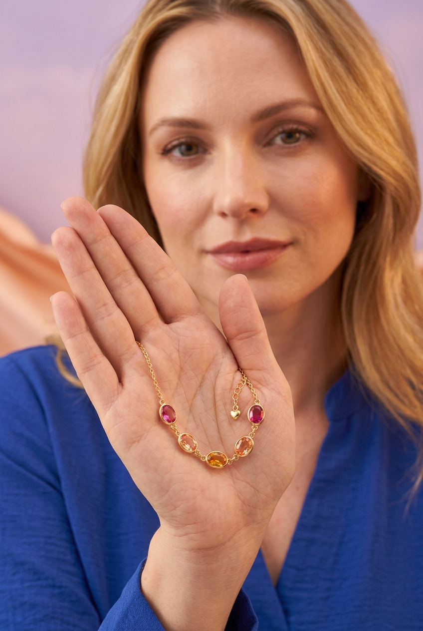
The fingertip presentation shows the bracelet as a suspended curve, with the central amber accent at the bottom and the two pink accents toward the sides. It helps separate the front section from the fine chain and makes the mirrored arrangement easy to follow. The open-palm presentation brings the same design into a closer, more intimate view, showing how the colored section relates to the small heart detail above it.
These scenes are visual references, not size guides. They illustrate the intended proportions of the concept but do not establish bracelet length, accent dimensions or weight. Use the clean white-background image to study the overall shape without the styling props, and the macro images to inspect the pictured facets and closure elements.
📌 The Practical Reading: What the Images Establish and What They Do Not
The intended design is one bracelet with five warm-colored oval accents, a gold-tone fine chain and a small heart detail near the closure. The clothing, pedestal, fabric and coffee cup are scene-setting props, not a pictured bundle of included accessories. The five accents are part of one color arrangement, not five separate bracelets or selectable gemstone options.
Gold-tone describes appearance only. It does not mean solid gold, establish a plating process or identify the underlying metal. Likewise, pink, peach and amber are color descriptions here. These concept images do not verify gemstone composition, skin compatibility, water resistance or durability testing.
The pictured extension links suggest several attachment points in the intended design, but the actual wearable length and adjustment range remain unverified. No universal-fit promise is made. Exact dimensions, materials, packaging and care requirements need to be checked against the manufactured item before this concept becomes a verified retail offering.
🌞 Keep the Warmth, Leave the Overthinking
At $39.96, Sunset Bloom is presented as a colorful design idea with a clear point of view: a symmetrical warm palette, individual oval outlines, a fine chain and one small heart. You can give it a neutral canvas, set it against navy or pair it with lilac for a softer contrast. Each route tells a different outfit story while keeping the same five-color arrangement at the center.
You do not need to repeat every color or build a matching set. Start with the shade you already enjoy wearing, then let the pink, peach and amber add their own rhythm. Sometimes the most personal part of an outfit is also the smallest.
Design concept disclosure: all images are AI-generated visuals, not photographs of a verified manufactured product. Actual specifications and real-item appearance must be confirmed before sale. Lighting and display settings may affect perceived colors.